Birdie Responsive Web Redesign
Project Overview
Birdie is a Social Recommendation Platform that helps our users find recommendations based on their close network. Birdie 's Founder Lauren came to us, she like us to develop birdie 2.0 that is more intuitive and user friendly. We took on the challenge and and successfully delivered a mobile first user friendly website. Through out the project, Lauren is our key point of contact, we also work along with Paul, technical team lead for any questions and discussion about technical feasibility of features that we are considering , and few other Junior Board Members who are the active users at Birdie.
My Role : User Researcher + UX Designer
Team : Anneliese, Ellen , Frannie, Jacklyn
Project Timeline : 3 Weeks
Design Process
Source: Interaction Design
Discover
Current Birdie Website Assessment: We Run a Heuristic Analysis Of Current Birdie Website
Heuristic Analysis Result :
Project Challenges and Goals:
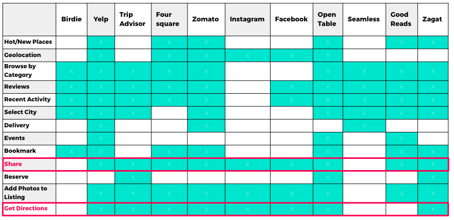
Competitive Research - Competitive Matrix
Competitive Research - Feature Analysis 1.1
Competitive Research - Feature Analysis 1.2
User Research : Screener Survey
Interview Process :
After the User Interview Process, we compiled our data into post-it note and created affinity map.
From the affinity mapping , we formed I statements :
- " I don't feel obligated to leave reviews "
- " I factor personal criteria when choosing a restaurant "
- " I want the inside scoop when traveling to a new place "
- " I find it time consuming to create an account / login "
- " I want to know what to expect before going to a new place "
- " I think discovering new place is exciting "
- " I find it time consuming to find and research restaurants "
- " I trusted my network because they know me "
- " I have methods to sort through the noise "
- " I have particular preference when keeping lists"
User Behavior Data :
- 93% ( 13/14) currently don't write reviews
- 86% ( 13/15) highly value their friend's recommendations
- 64% ( 9/14) keep a list of restaurants in various format
Define
What problem are we solving ?
we regroup and redefine our problem statement : " When choosing a restaurant, urban young professionals struggle to access their trusted network's recommendations in order to find one that fit their needs. How Might WE provide a space where our user can find relevant and valuable recommendation in a way that is engaging and efficient ? "
Who are we design for ? based on our user interviews we discover these two unique groups
Insider : Loves exploring and discovering new restaurants
- excited about discovering new restaurants
- knows all the good restaurants
- likes to look at restaurant lists and keep lists of their own
- known as the trusted source for new restaurants
- discover new restaurant on social media, such as instagram
Enthusiast: depend upon recommendation from the insider
- excited about delicious food
- trusts recommendation from their close personal network
- stars places in Google Map of his own town and when traveling to new places
- goes to restaurants for the food first, atmosphere second
Design Studio
Imagine what the experience could be for our end user
In Our Initial brainstorming session , we defined the key goal and feature that we would like to build into the site based from our user goals and needs
User goals :
- find reliable recommendations more efficiently
- make list of notes about restaurant easily accessible
- sharing recommendation with friends easily
Key Features
- Added a " All friend chirps" button directly on home page
- Housing both saved places and all chirps on "my lists"
- Add a share to text and email feature that allows selection of specific restaurants
Moscow Feature Prioritization session
Story Boarding Session
After feature prioritization session , we did few rounds of story boarding before jump into wireframing in sketch.
Usability Testing - 4 Rounds
Utility
- 3 of 5 found the home page crowded and not helpful in completing tasks
- 4 of 5 liked the share feature to text
- 4 of 5 wanted to see all friends collections at once
Usability
- 3 of 5 confused by “My Collection”
- 3 of 5 could not find their list of “to try” saved restaurants
- 4 of 5 could not save their restaurants to their to try list
Usability Testing : KPIs:
Design Iterations : Save a Restaurant that you want to try :
Design Iteration : Home Page
Design Iterations : My Lists
Problem Solving : Overcoming Design Problems
Phase Feature Roll Out Plan :
Final Version Prototype Screens:
Conclusion
Teamwork is great work , we have a lot of fun doing this project with Lauren , also thanks for all the sweet dessert and cake she brings to our meeting. As for Design, We iterated many times with testing different terminology that the site could use. It is interested to see how people respond / not respond to the different terms . For landing page, we iterate many times as well,one of our intention is to convey the value of what birdie does to the new user upfront, but not cluttered up the screen, it took a few try to get to the right medium. Overall, we are satisfied and proud of what we have created together.
Looking forward for birdie to reach to more foodies around the world , go birdie ! 😍🍱🍿🥘🍧🍡🍔🍕🍪🎂


