
Eataly - Responsive Web Redesign
Eataly Redesign
Project Overview
As one of our GA User Experience Designer Program, we were given an assignment of creating a responsive web design for an existing product. We were given Eataly as our client to help them revised their website and mobile to help them create a better functioning product. We utilized various methods to carry out our goal. We did a contextual inquiry at the store, heuristic analysis on the current website, usability testing on the current website, competitive research, user interviews, usabilities testing on revised Eataly Website, card sorting to clean up the information architecture about the categories at the site, revised site map. We built and delivered an responsive web that is more intuitive and user friendly.
My Role: User Researcher & UX Designer
Team : Dave Devine , Ellen Li , Marta Licul
Project Timeline : 2 weeks
Design Process
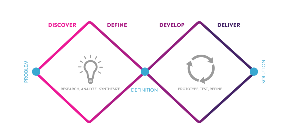
Discover

Eataly Store in Flatiron District
In our contextual inquiry, we discover that Eataly’s store customer is very loyal to the brand, many regular customers that come to the store three times per week. They come to the store for fresh fish, fresh fruit and vegetable, they come to the store for also the specialties items that they can’t find it anywhere else. The site we visited is in flatiron district, the store is pack with many tourist, it is the top site for tourist to come to taste the Italy, the motto for Eataly is “ Eat, Shop and Learn”. Tourist come to the store to Taste the Flavor of Italy. There are six restaurants inside the crowded Flatiron store, the store is packed everyday with neighborhood customer and tourist. The site is packed with many good that is imported directed from Italy, the whole vibe of the store is very different from a regular supermarket; Many products in the store has map and poster sign that tells the customer the origin of the product, where the product is coming from and the story behind it .
Our team and I have observed store customers and we have also interview them about their weekly shopping habit, some customer come to the store up to four times a week. A local student Jenny who lives nearby said that she comes to the store about four times per week, she has never heard about Eataly website and she has never use it either. A Local Mother of two said that she come here to shop for her whole family and we saw that she has a long list of things that she wants to get from the store, she said that some product the price is higher, but you can’t find it anywhere else. At the Fish department, we interviewed a young woman Stephany: she said "I came here after work to get some fresh salmon, the fish is very fresh here! i like to come after work, it is usually crowd when she comes, and the one in the downtown is less crowd " . Of all the people we observed and interviewed, none of the customer have use the Eataly website. But we know that they are very loyal to the brand and they love to shop at Eataly and they keep coming back every week.

Contextual Inquiry Note Taking
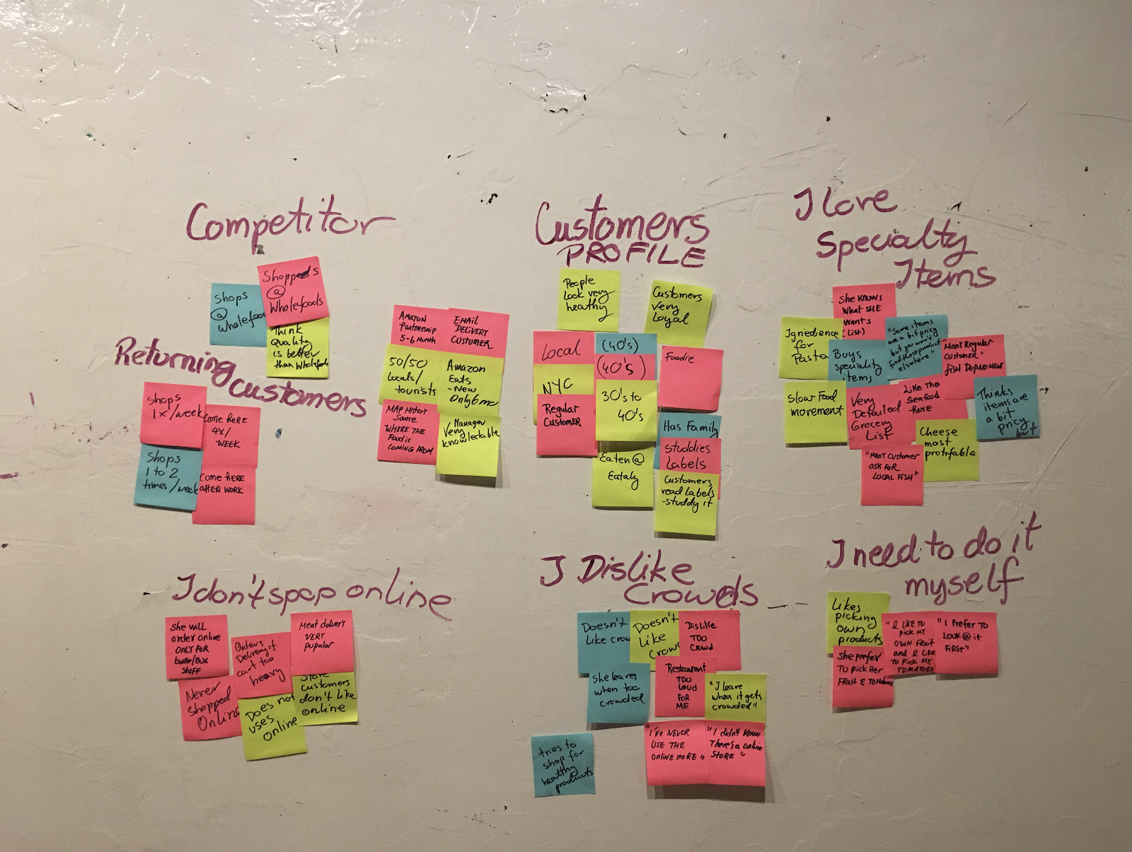
Conceptual Inquiry Synthesis
Define
After the initial visit to the flatiron Eataly site , we come up wth our initial problem statement: " Eataly ‘s store customers love the Eataly brand , they love the store experience and what Eataly has to offer, how might we bring similar experience to Eataly's digital platform both in mobile and in website ?"
Our next step is to test the current Eataly website in order to gather data about how current website’s architecture works for customer. We did usability’s testing with ten people and we gather and synthesis the data into a like, dislike, quote and behavior chart . We founded a common pattern with the website and we also found a common pattern with the mobile app.
We interview a total of 10 people – 6 website , 4 mobile
Usabilities Testing Synthesis
Web
- Label is confusing : tomato is weird because she think tomatoes as produce
- “ I guess meat is in the fresh ?
- I found the product detail don’t make sense to me
- I wish the search for recipe function is functional
- I find the page are overwhelming
- I can’t find the recipe button
- Where is the recipe , under magazine ?
Mobile
- The search is not working, It only works in the first page
- The categories is not clear
- Fresh is confusing, I’m guessing mea is under fresh ?
- Notice too much gift box sale annoying
- Search for cannoli no result
- no clear filter for events
- There is no clear recipe tag
- Frustrated that the only way to find the course is to scroll through
- There is no search bar in recipe section : how do I find the recipe I wanted
- Product description not helping
- Search function - not functioning on certain page
- can’t find the recipe
- recipe – there is not filter
Heuristic Evaluation:
Link to Heuristic Evaluation Chart: https://docs.google.com/spreadsheets/d/1AWYoRYaYq-bZfBqHkFit6dIewpBrqJHwj1VtWlsmtO8/edit#gid=335312062
Home Page needs some updating and maintenance
Looks old fashioned
Categories are not customer friendly and sometimes confusing.
Large pictures in front of the product list add unnecessary scrolling motion
Some filters are useful but some are not
Online purchase: No option of picking up food at the store when
Magazine: Recipes are difficult to find and the menu offers no option
Product page: Product details are insufficient.
Information Architecture - Card Sorting _ 100 Inventory List

Round 1 - Closed Round with Customer’s Categories
5 completed and 6 abandone
11 people participated and 5 (45%) of those people sorted all 100 cards.
75% of items were identified as “Pasta & Pantry”
This indicates this group is too broad and needs to be narrowed down
Category “Fresh” is confusing as people associated vegetarian items with “Fresh”
Will change that category to Butcher to better identify it
Round 2 - Open Study Round with Customer’s Categories
6 completed and 2
abandoned.
8 people have participated and 6 (75%) of those people sorted all 100 cards into an average of 13 groups.
Customers Created on average 15 categories
Canned food and jars, Condiments, DIPS/spreads/dressings have close association and could go into one category
Round 3 - Closed Round with Customer’s Categories
“Sauce” as well as “Spreads & Preservatives” were used interchangeably often
Need to change this categories or grouped them
Butcher category worked much better than “fresh” for the meat products
Statistically the first round of card sorting performed better but it was because majority of items went to “Pantry”
Roi-Sun Dried Tomtoes Cream - 3 people selected 3 different categories: Sauce, Spread & Preservatives and Canned Food
Riolfi - Herbal Bell Peppers in Oil - 3 different selections: Spread, Specialty and Canned Food
Calvisius - Siberian Sturgeon - 3 different selections: Herbs, Specialty and canned food
Specialty and canned food seem to have close correlation
Card Sorting Synthesis Team Discussion :
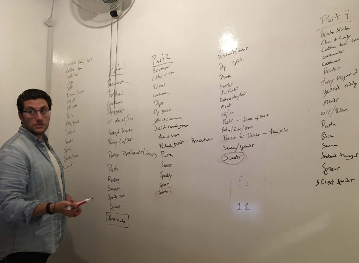
Translate Finding Into Re Structuring and Re Naming the Catogories :
We found that the current category is not intuitive for people, many of the label is confusing to people, categories such as fresh, pasta and pantry, tomato and sauce. people is confusing that the meat is sort under fresh, they first thought of fresh is fresh fruit and vegetable, many people are confusing about the label pantry, in our card soring result, 4 people drop 50 + item in the pasta and pantry category. In the second open card sorting, we are testing what kind of category people come up with, we founded many similarities, based of people ‘s category, our team come up with new categories and create a new round of card sorting and send to people.
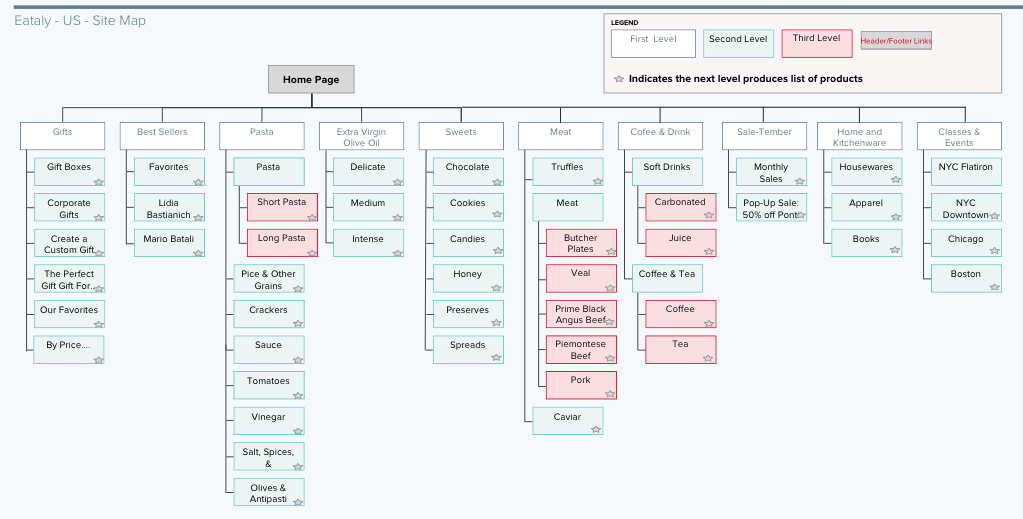
Based on our data gathering from usability testing and card sorting result, we decided to remove the label fresh, and remove the label pantry. We decide to create a new category meat, a new category, kitchenware and home, we decided to keep the category coffee and drink, we decide to combine preserve and spread, we decided to keep the category sweet, and we decided to create a condiment.
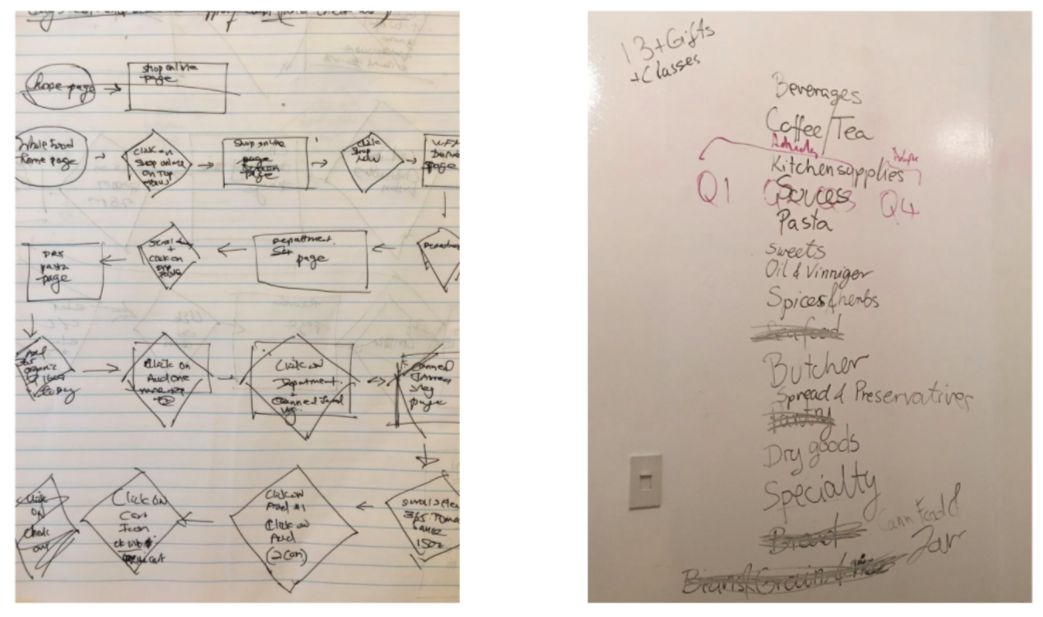
Draft for User Task Flow and Draft for Site Map
Revised Site Map
Competitive Analysis Research :
In our research phase, we also did an extensive competitive research on the current high-end supermarket, Our first-Tier competitive feature analysis is whole food market, wegman and trader joe, our second-tier competitor is amazon fresh, good eggs and peapod, our third-tier competitor is blue apron.
Feature Analysis and Product Analysis

Competitive Analysis 1.1

Competitive Analysis 1.2

Competitive Matrix

Who are are serving ?
After all of our data gathering and data synthesis, we created our persona based on the data that we received, and we refine the key pain points , key goals and need that we wanted to resolve for our customer.


Develop and Deliver
In the ideation stage, I brainstormed many possible ideas that the product redesign can help re-create similar store experience that customer received in the store. To keep the customer's pain point and needs in mind, I listed all of the features that could be add to the new website design , I then break these features down into four categories using the Moscow Chart, must have, should have, could have , won't have .
INSERT HERE : DESIGN STUDIO SKETCH PHOTO

Prototype Version 1 :
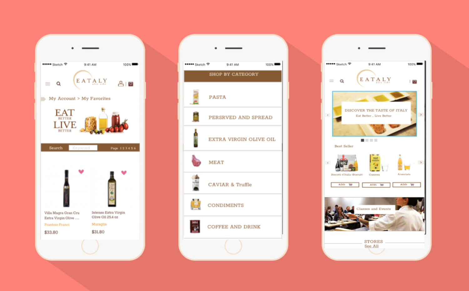
Picture Shop by Category
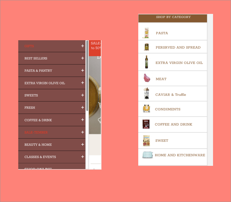
New Information Architecture and New Picture Interface
Prototype Version 1 : Usability Testing
Dislike :
- Confusing button vs page title
- Clickable bottom where it should be page title
- User wants review
- User want more product detail
- User wants customer review and starts
Likes
- User like the visual category
- User like the recipe section
- User like the new sort by type
Prototype Version 2 :

simplified ordering process & simplified landing page
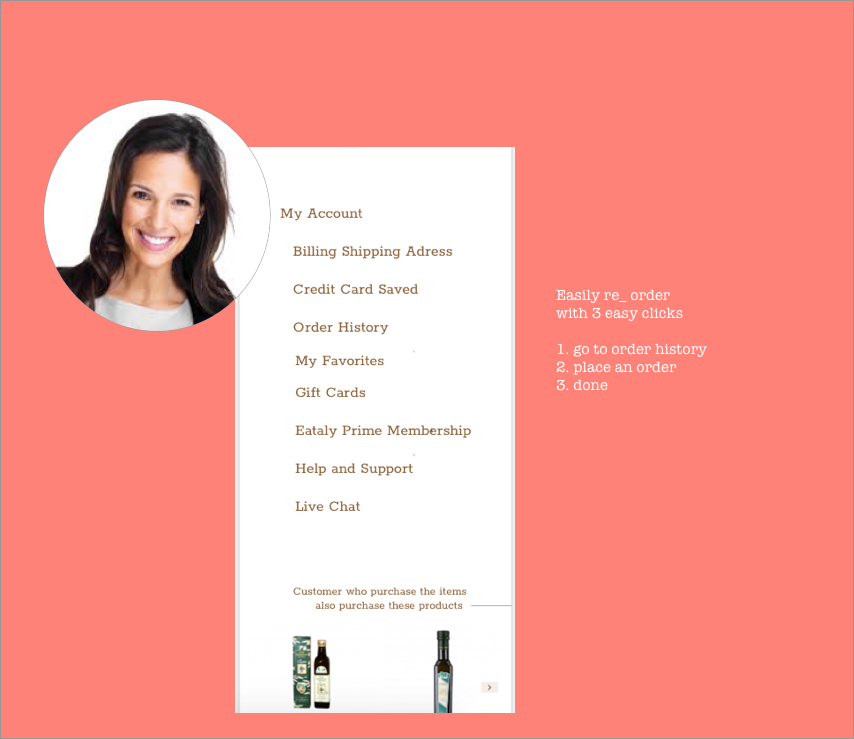
Prototype Version 2 : Usability Testing
Likes
- Visual navigation is clear
- Clear category label
- Simple check out flow
- " Chef’s recipe is useful "
- " Sort by type is more useful than sort by state"
- Product page detail add detail recipe, how to, and recommended recipe to try
- Product page is more engaging
- Likes My account order history – quick order
- Likes account my favorite history – quick order
Eataly Phase Role out Plan:
Phase 1
- Global Navigation, Local Navigation, Facet Navigation
- Creating engaging product page, Recipe recommendation and recipe to try recommendation link to ingredient to buy
- Chef’ Recipe on the Landing Page
Phase 2 –Social Media, Class Sign Up New Format
Phase 3 - Eataly Prime Membership
Feature Mobile Screens

Intital desktop revised version with new information architecture

Conclusion
In the Journey of designing a revised version of EATALY , I see how important the right information architecture on usability and user experience, I see using the right name/ language that most people are intuitive with are very helpful in assisting customer navigating within the site. Card sorting is a great tool to uncover what categories are most intuitive for our users. Another point in designing a more usable website is thinking about shorten or eliminate the steps that customer need to take to reorder what they buy regularly, this specific enhanced feature make it more likely for customer to come back and do reordering at EATALY.